Usability Metrics Explained
How easy is it to use a digital system? This seemingly simple question is central to UX research - and complex at the same time. Standardized metrics are used to make usability not just perceived, but objectively measurable. They measure how effectively, efficiently and satisfactorily users can operate a system. These three dimensions - effectiveness, efficiency and satisfaction - are anchored in the ISO 9241-11 standard and form the foundation of many UX evaluation strategies.
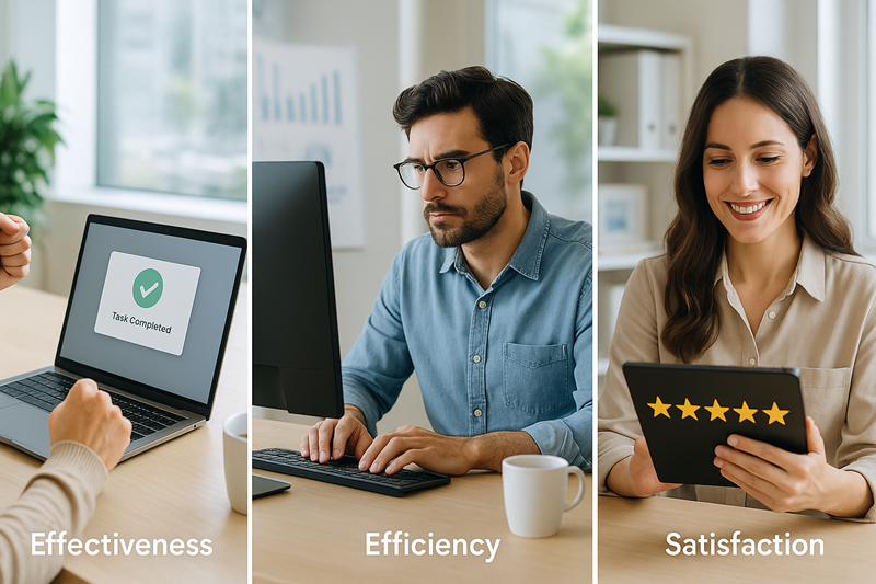
#1. Effectiveness: Are Users Achieving Their Goals?
A central criterion of good usability is the question: __MARKBOLD_Do users reach their goal? The so-called Task Success Rate provides information here. It measures how many people successfully complete a defined task - for example, placing an order or submitting a form.
Practical example
An online store wants to know whether its checkout process works. In a usability test, 12 out of 15 people manage to complete the purchase process without errors. The task success rate is therefore 80% - a solid figure, but one that could be improved.
The error rate, i.e. how often operating errors occur - such as double clicks, incorrect entries or disorientation - also helps. Partial successes* (e.g. task was completed, but not optimally) also provide differentiated insights.
2. Efficiency: How Much Effort is Required?
Usability also means: goals should be achievable with as little effort as possible. The time-on-task (processing time) measures how long users need to complete a task. It is either stopped (in moderated tests) or recorded automatically using log data and tools.
Practical example
An insurance company is redesigning its claims notification online. Before the redesign, the process took an average of 6:40 minutes. After the introduction of clear wording and a progress indicator, the average processing time drops to 3:45 minutes - a time saving of 44%.
The number of necessary clicks or navigation steps (interaction costs) and duplicate entries (repeat effort) are also considered efficiency indicators.
Important: Less time is not automatically better - some tasks rightly require care. Therefore, the combination of success rate and qualitative observation is crucial.
3. Satisfaction: How Do Users Feel About Using it?
In addition to numbers, the subjective perspective counts: How pleasant, clear or frustrating do people find the use? Standardized questionnaires are used for this dimension of satisfaction.
The System Usability Scale (SUS) is used most frequently. It consists of ten statements that are rated on a scale of 1 to 5 - such as “I found the system easy to use”. The SUS score calculated from this ranges from 0 to 100. A value above 68 is usually considered above average.
Practical example
After a test with a health app, the application achieved an SUS score of 74. In addition, the Net Promoter Score (NPS) shows that 60% of users would recommend the app to others - a strong indication of a positive overall experience.
Other instruments such as the User Experience Questionnaire (UEQ) or AttrakDiff enable more differentiated statements - for example on the clarity, attractiveness or originality of the design.
Supplementary Metrics: What Else Counts
- The abandonment rate shows the point at which users leave processes (e.g. order abandonment in the checkout).
- The Reuse or Retention Rate gives an indication of the long-term acceptance of use.
- Support_requests indicate information gaps or UX problems.
Practical example
A software provider observes that the number of support tickets for navigation increases sharply after the introduction of a new dashboard. Although the task success rate remains formally unchanged, there is a clear need for optimization from the user’s perspective.
Best Practices in Dealing with Usability Metrics
- Combining instead of isolating: The combination of objective and subjective metrics (e.g. time-on-task + SUS) provides the most rounded picture.
- Kontext beachten: A task in a B2B environment requires different metrics than a leisure app.
- Don’t just look at mean values: A high variance in processing time can indicate hidden UX problems.
- Classify results: Benchmarks or before-and-after comparisons increase the informative value.
Conclusion
Usability metrics are far more than just numbers - they make ** user experiences tangible**. Correctly collected and interpreted, they enable well-founded decisions for UX optimization, show progress and help to prove design quality to stakeholders. The decisive factor here is a context-sensitive, reflective use - and the addition of qualitative insights.
Frequently asked questions (FAQ)
What three dimensions does ISO 9241-11 define for usability?
What measures effectiveness?
How is efficiency measured?
How do you measure satisfaction?
Which additional metrics are relevant?
Why should you combine metrics?
UX metrics and quantitative survey tools
These articles deal with established and new quantitative methods for measuring user experience. The focus is on standardized scales, comparison metrics and strategic tools for UX evaluation.
The Usability Metric for User Experience (UMUX)
Introduction of the compact UMUX questionnaire (4 items), which is similarly reliable to the SUS and is based on ISO 9241-11.
Finstad, K. (2010). The usability metric for user experience. Interacting with Computers, 22(5), 323-327. https://doi.org/10.1016/j.intcom.2010.04.004
Measurement Practices in User Experience (UX) Research
Systematic analysis of 153 CHI studies. Shows common UX scales (SUS, UEQ, NASA-TLX) and criticizes their partly unsystematic use.
Perrig, S., Aeschbach, L. F., Scharowski, N., von Felten, N., Opwis, K., & Brühlmann, F. (2024). Measurement practices in user experience (UX) research. Frontiers in Computer Science. https://doi.org/10.3389/fcomp.2024.1368860
Quantifying User Research
Textbook chapter with detailed explanation of metrics such as task success, time-on-task, errors and satisfaction - ideal for practitioners.
Sauro, J., & Lewis, J. R. (2012). Quantifying user research. In Quantifying the User Experience. https://doi.org/10.1016/B978-0-12-384968-7.00002-3
The UX Metrics Table: A Missing Artifact
Proposal of a 'UX Metrics Table' as a strategic artifact for metrics selection and iteration control in UX projects.
Wallach, D., Conrad, J., & Steimle, T. (2017). The UX metrics table: A missing artifact. In Design, User Experience, and Usability. https://doi.org/10.1007/978-3-319-58634-2_37
Supporting User-Perceived Usability Benchmarking
Development of a reaction card-based quantitative index for subjective usability perception including a comparison tool.
Veral, R., & Macías, J. A. (2019). Supporting user-perceived usability benchmarking through a developed quantitative metric. International Journal of Human-Computer Studies. https://doi.org/10.1016/j.ijhcs.2018.09.012
Last modified: 21 December 2025